Maintaining Consistency Across Web Pages
Consistent colour and font usage builds trust. Discover how to apply your brand systematically without making your website feel rigid or boring.
Why Consistency Matters
Think about visiting a website where the logo changes colour on every page, fonts shift between sections, and the button styling differs randomly. It’s unsettling, right? Consistency isn’t just about aesthetics — it’s about building trust with your visitors.
When users navigate your site, they’re unconsciously learning your visual language. A consistent palette and typography create muscle memory. That blue button you used on the homepage? Users expect it to work the same way on your services page. That headline font? They’re already comfortable with it.
The challenge isn’t making everything identical — that’s boring. It’s about creating a system that feels intentional, professional, and trustworthy while still having personality and visual interest.

Building Your Colour System
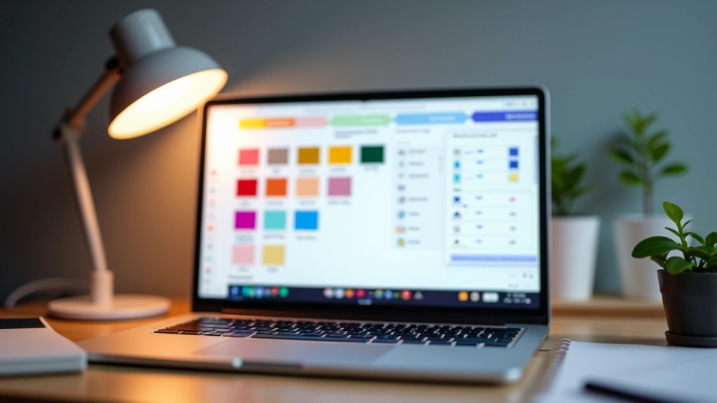
Start with 3-5 core colours. That’s it. You don’t need dozens of shades floating around. Choose a primary colour (usually your brand’s main hue), a secondary colour for contrast, and maybe one accent colour for important actions.
Let’s say your primary is a deep teal. Use it consistently for headers, buttons, and key design elements. Your secondary might be a warm neutral that balances it. Then your accent — perhaps a coral — appears only for CTAs or urgent information. This creates visual hierarchy without chaos.
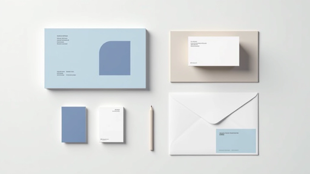
Document these colours with hex codes. Share them with your team. Use them everywhere — homepage, about page, blog, contact forms. When a new page gets created six months from now, that teal is still there. That consistency tells visitors they’re still in the right place.
Typography That Feels Unified
Pick two typefaces maximum. One for headings (something distinctive), one for body text (something readable). We’re not designing a magazine cover here — we’re building something that works across 20+ pages without feeling chaotic.
Define your type scale early. H1 at 2.5rem, H2 at 1.75rem, body text at 1rem. Stick to it. When someone’s writing a new page, they’ll use these sizes. When you’re updating the site in two years, you’ll know exactly what size a headline should be. That’s the power of consistency.
Line-height matters too. Your body text should breathe — around 1.6x the font size gives good readability. Keep it the same across every page. Your readers’ eyes will thank you, and you’ll look like you’ve got your act together.
Where Consistency Lives
These are the places where consistency makes the biggest impact on your visitors’ experience.
Navigation & Headers
Your main navigation appears on every single page. If the styling changes, users get confused. Keep the layout, colours, and font consistent. Your header is the one element everyone sees.
Buttons & CTAs
Every button should feel like it belongs to the same family. Same primary colour, same padding, same hover effect. Users learn what buttons do by recognizing their visual style.
Image Styling
Do your images have rounded corners? Shadows? Border colours? Apply the same treatment across your site. This simple detail ties everything together visually.
Cards & Blocks
If you’re using card layouts for services, testimonials, or blog posts, keep them identical in structure. Same padding, same shadows, same spacing between cards.
Footer Design
Your footer appears on every page. Match the visual style to your header. Use the same secondary colours, fonts, and spacing you used elsewhere on the site.
Form Elements
Contact forms, newsletter signups, search bars — these all need consistent styling. Same input borders, same focus states, same button treatment.
Making It Practical
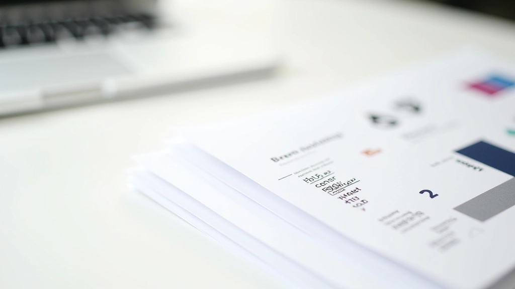
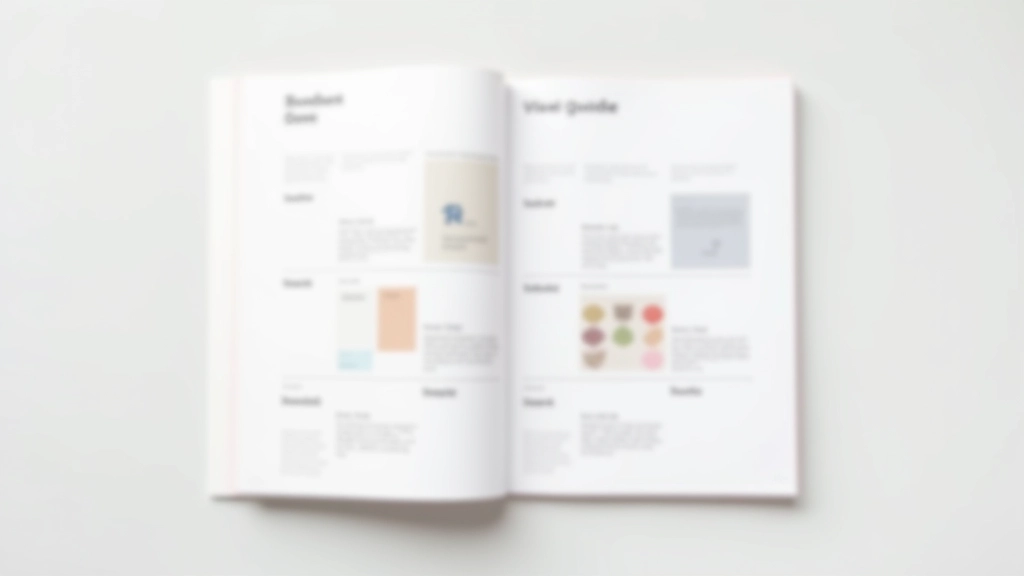
Here’s where most brands stumble — they’ve got great colours and fonts picked out, but nobody’s actually documented how to use them. Create a simple brand guideline document. Yes, a document. Even a one-pager.
Write down: primary colour hex code, secondary colour, accent colour. List your typefaces. Show examples of how buttons should look. Include a screenshot of your navigation. When your developer or designer builds the next page, they’ve got a reference. When you hire someone new in six months, they’ll know exactly what your brand looks like.
If you’re using a content management system, set up CSS variables or design tokens. This way, if you ever need to adjust your primary colour slightly, you change it in one place and it updates everywhere. That’s not just consistent — that’s smart.
The goal isn’t perfection. It’s recognizability. When someone lands on your homepage, clicks to your services page, reads a blog post, and fills out a contact form, it should feel like one cohesive experience.
Consistency Doesn’t Mean Boring
Here’s the thing — you can be consistent AND interesting. Consistent colour doesn’t mean every page looks identical. Use your teal as the primary, but vary which sections it appears in. Feature it heavily on the homepage, subtly on your blog. This creates visual rhythm.
Your typography system allows for variation too. Keep your headlines in the same font family, but play with weights. Bold, regular, light. Italics for emphasis. Different sizes for different sections. You’re working within a system, not fighting against it.
Layouts can shift — one page might have a hero image, another might have a text-focused intro. Images might be square on one page, rectangular on another. What stays consistent? The visual language. The colours. The fonts. The button styles. The spacing rhythm.
Think of it like a jazz band. Every musician is playing in the same key with the same tempo, but each one’s got room to improvise. That’s what good brand consistency feels like.
Start Building Your System
You don’t need to redesign everything today. Start where you are. Look at your current site. What colours are you already using? Pick the ones that feel most like your brand. What fonts appear most often? Those are your candidates.
Write down five things: your primary colour, secondary colour, accent colour, heading font, and body font. That’s your foundation. Apply these five things consistently across your next update. Then add one more rule — how your buttons look, or how your cards are styled.
Build gradually. Each small decision reinforces the next. After six months of consistent application, visitors won’t think about your colours or fonts — they’ll just feel like they’re experiencing something cohesive and trustworthy. And that’s exactly the point.
Ready to audit your brand consistency?
Take screenshots of your homepage, about page, blog, and contact page. Look at them side by side. Are the colours consistent? Do the fonts match? Do the buttons look the same? That visual audit will tell you exactly where to start.
Explore More ResourcesImportant Note
This article provides educational information about web design principles and branding consistency. The guidelines and suggestions offered are general best practices and may need to be adapted based on your specific business requirements, industry standards, and technical capabilities. Brand implementation varies depending on your CMS platform, design tools, and development environment. Consult with a professional designer or developer for personalized guidance on implementing these strategies for your particular website.
Related Articles